Presentation Boards with
InDesign

Master Effective Presentation Boards
Dive deep into the art of presentation board creation, from foundational concepts to advanced design techniques.
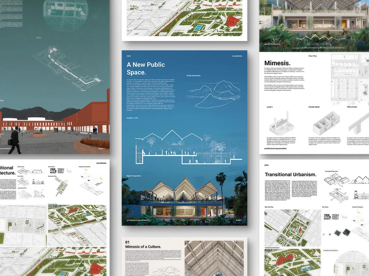
This course offers a comprehensive guide to constructing impactful boards that clearly communicate your architectural ideas.
Learn to strategically use color, typography, and composition to enhance your project narratives. Gain practical experience with Adobe InDesign, enhancing your ability to create professional-grade presentation materials.
By the end of our course you’ll be able to:
This course is designed to elevate your architectural presentation boards from ordinary to extraordinary, giving you the tools to communicate your visions effectively and stand out in the professional world.


This course can help
if you are a:
This course is Ideal for architects seeking to sharpen their presentation skills and elevate their project pitches.
- Ideal for building a solid foundation in presentation skills.
- Enhance academic projects and portfolio.
- Learn industry-standard tools early in your career.
- Perfect for honing presentation skills as you enter the professional world.
- Set yourself apart in job applications and interviews.
- Transition from academic to professional standards seamlessly.
- Great for those looking to refine their hobby into a more serious pursuit.
- Improve the ability to express architectural ideas clearly.
- Gain confidence in participating in local projects or competitions.
Unlimited access to
resources and free content.


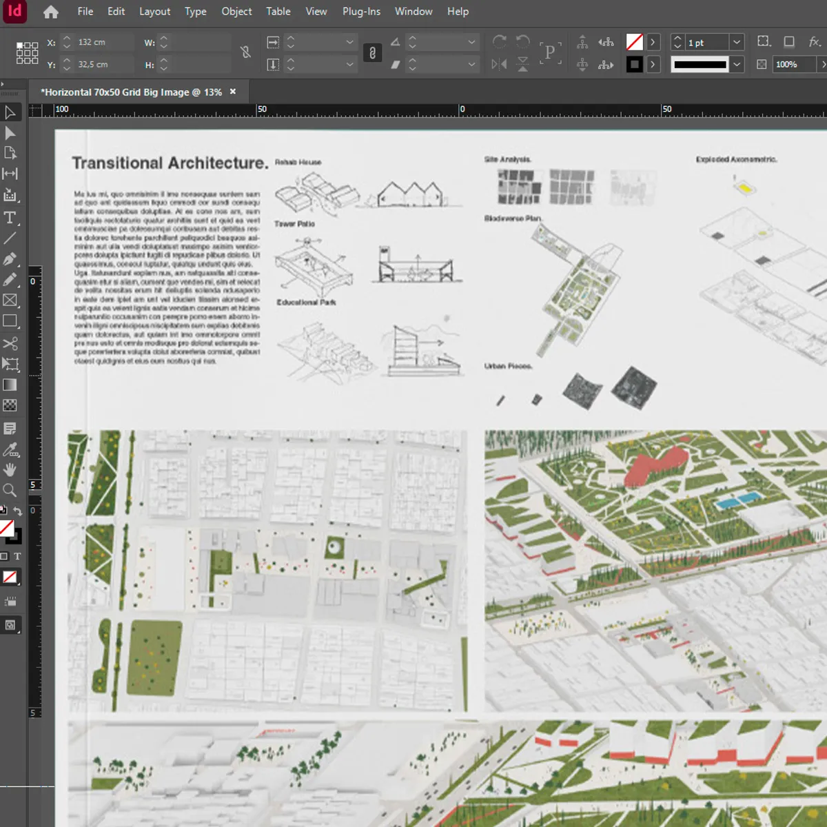
What you will see in this course
Through a step by step guide, and deep understanding of boards in your project, we structure this course in the following way:
Hi! I'm Steven
In 2016 I created Show it Better because I believed that the first step to great architecture, is knowing how to communicate it.
Unfortunately, at the time there wasn't a place where you could learn how to visually communicate your architectural ideas. So I created a YouTube channel where I could create free quality content for everyone to learn architectural representation.
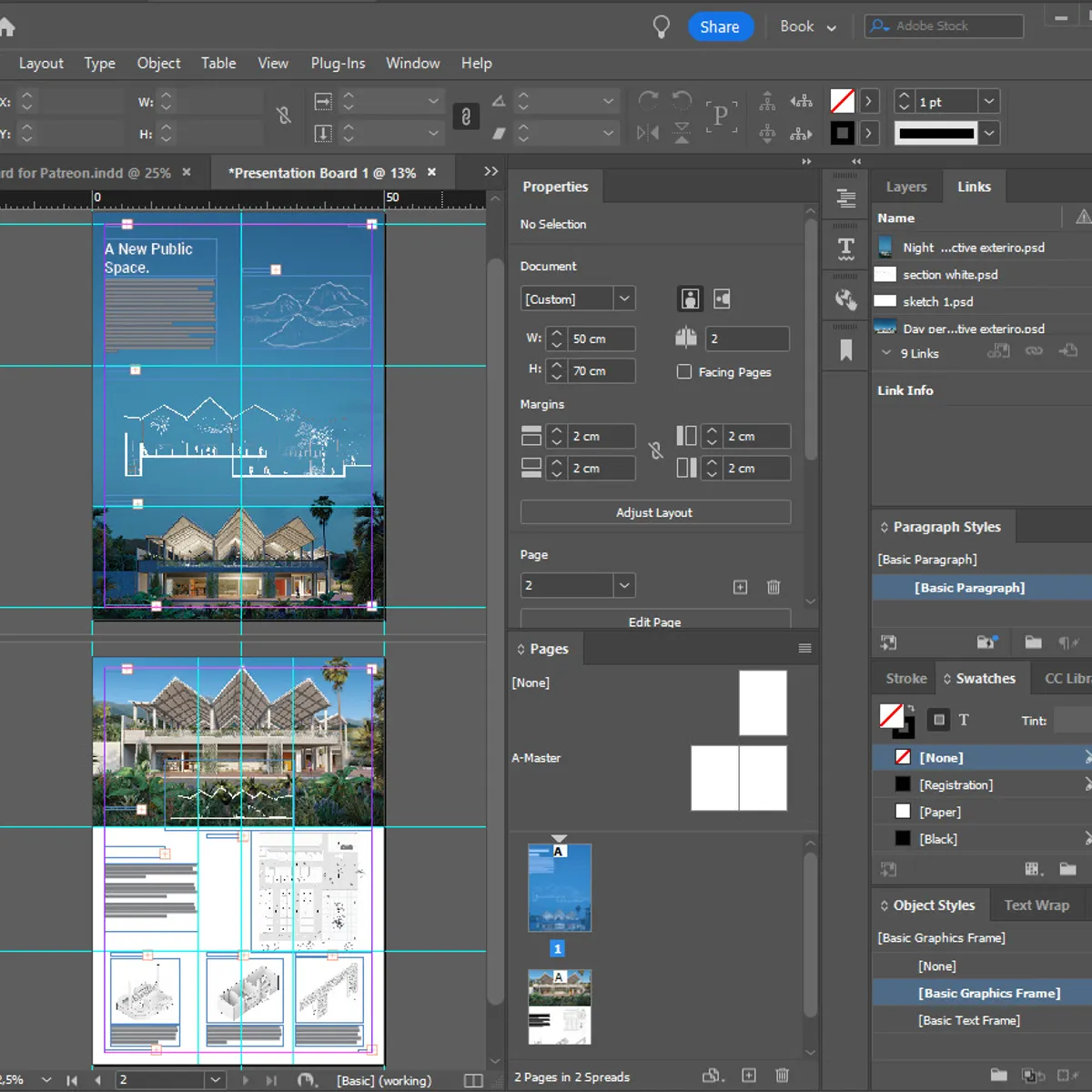
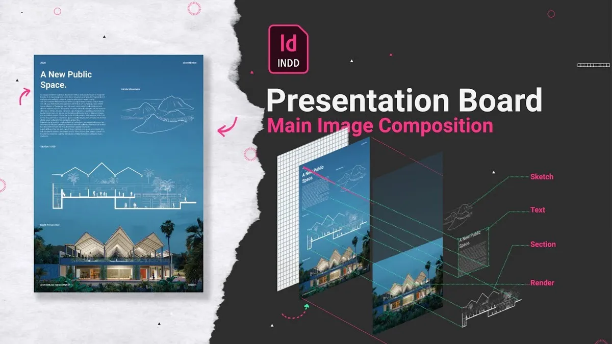
In this course about Presentation Boards, I have the opportunity to visit InDesign and give you a Beginners introduction to how to create presentation boards.

We're on a mission to revolutionize how architectural education is delivered
Traditional methods don't quite cut it anymore, and we believe digital platforms offer a dynamic and accessible way to learn, share, and create.
Here, we’re not just about offering courses; we're about building a community that learns from each other. We develop resources, host courses, and provide free content aimed at nurturing a passion for architectural drawing and the communication of spatial ideas.
Join us as we explore new dimensions in architectural visualization and keep pushing the boundaries of what's possible!

Presentation Boards with
InDesign
Explore our online
courses for Architects.